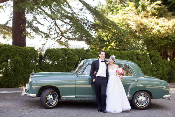
Posing in front of our 1950s moss green ride on a gorgeous summer day in the Pacific Northwest
Last month, we celebrated our one-year wedding anniversary. It was literally the ultimate art project as I doubled as both bride and wedding designer/planner! Here are a few photo highlights from our Jamie Lau Designs handmade wedding, which was also featured in Martha Stewart Weddings this past spring with photos by my superstar photographer Kim Hayes.
The Dresses
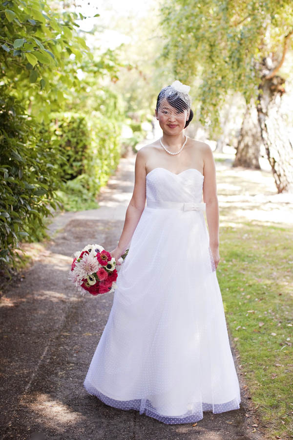
I designed my own wedding gown, which was sewn in ivory silk shantung and dotted flocked tulle
For my wedding gown design, I wanted something soft, light, and airy, but also an element of texture and dimension. I found a beautiful Italian ivory silk shantung that served as the dress base and dotted flocked tulle made in France for the skirt and draping. I designed a strapless corseted bodice with a soft sweetheart bustline. The skirt silhouette was a modified A-line with a subtle train and layers of crinoline and ruffles for more fullness. The silk shantung base was followed by two layers of tulle (the top layer was a dotted flocked tulle and the second layer was a neutral tulle to balance out the color variation to match the silk shantung).
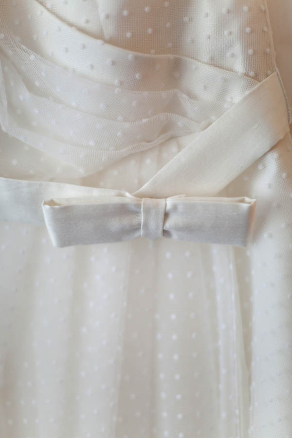
A geometric waistband decorated with an asymmetrical bow detail
The flocked tulle looked like an illusion of pearls in the afternoon sunlight and the gown was cinched at the waist with a geometric waistband decorated with an asymmetrical bow.

Jamie Lau Designs bridesmaid dresses sewn in Japanese fabric. For Janet (left), I designed a dress with a round neckline, short set-in sleeves, and a two-tiered flounced skirt. For Christine (right), I made a halter dress with a sweetheart neckline and gathered-waist skirt.
I designed and sewed my bridesmaid dresses. Both ladies had very different body types and I wanted to give each of them something functional that they could wear again. I also love prints and wanted to stay true to my design aesthetic, so I chose a woven Japanese fabric that I wanted to make modern. The print consisted of arches of concentric circles forming a wave design (a seigaiha motif). In addition to the print, I was also drawn to the color, which resembled burgundy or red wine (but I like to think of it as red velvet), similar to the darkest gradient on my wedding cake.
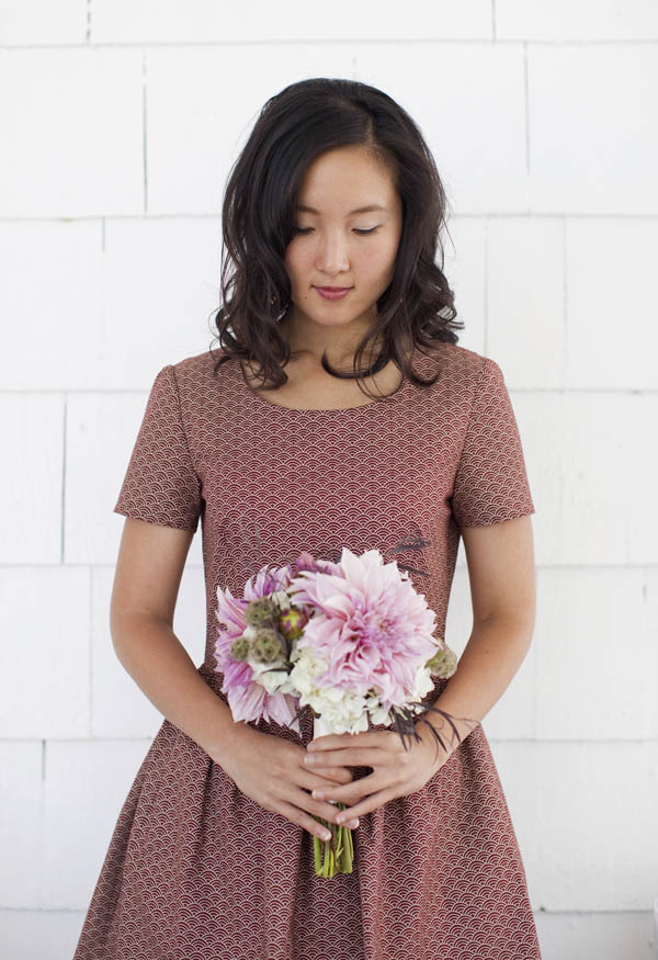
Japanese fabric with a printed seigaiha motif
The Cake
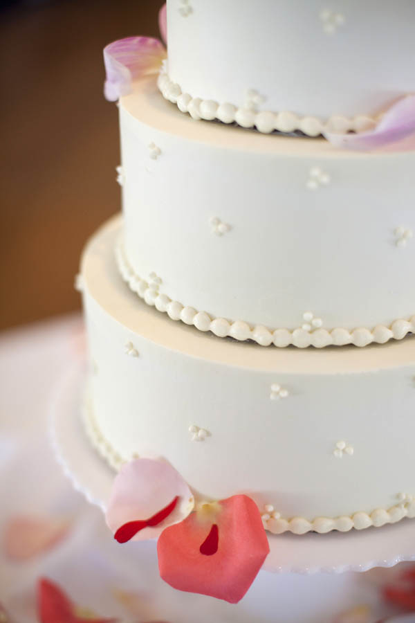
Our three-tiered wedding cake was minimally decorated on the outside with trios of Swiss dots and consisted of white chocolate cream cheese and buttercream frosting
I didn’t initially set out with a specific “wedding color” in mind until I landed on the wedding cake design – an ombré red velvet and white cake. I approached a local bakery to see if they could accommodate my custom design and they delightfully agreed. I wanted a three-tiered cake that was clean and minimally decorated with trios of Swiss dots on the exterior.
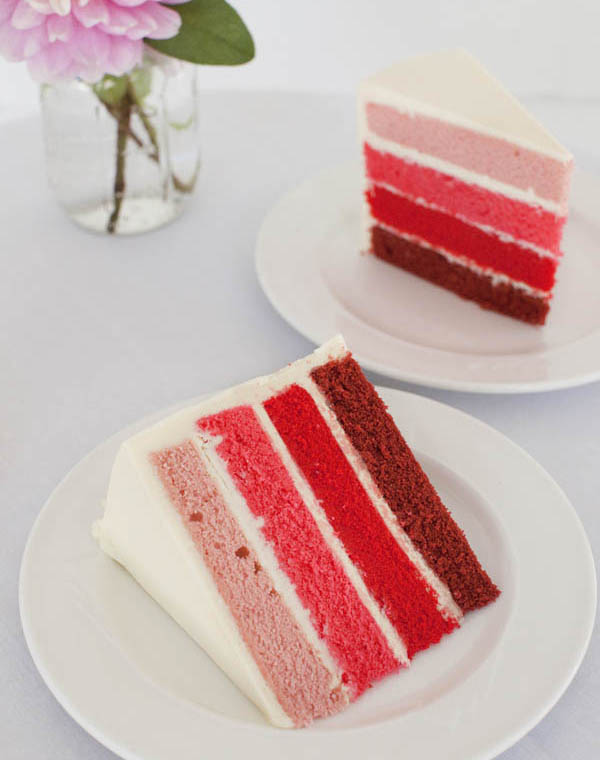
A surprise of four layered sheets ranging from soft cherry blossom pinks to red velvet gradients
Within each tier was a surprise of layered sheets ranging from soft cherry blossom pinks to red velvet gradients. Since my fashion designs are heavily influenced by Japanese aesthetics, and we were traveling to Japan for the cherry blossom viewing on our honeymoon, having some semblance of cherry blossoms – even if it were just in color – carried over into the overall mood and theme of the wedding.
The Invitations
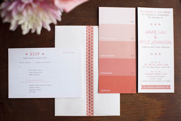
Invitations reminiscent of going to the paint store as a child
The wedding invitations followed this theme as well. I designed my invitations and collaborated with a graphic designer friend, Hikaru Furuhashi, to execute my creative vision. When I envisioned my cake, I was inspired by going to the paint store as a child and recalled how I always collected paint chips in my favorite hues, so I automatically thought of a paint chip design for the front of the invite that resembled the warm colors of the ombré red velvet and white cake. These colors, in turn, became my wedding color (palette!). I sealed off the envelopes using coordinating washi tape with a traditional Japanese print.
The Flowers
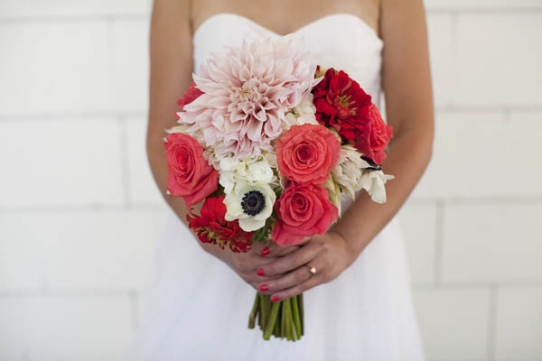
A bridal bouquet of full blooms – dahlias, roses, zinnias, scabiosa pods, and anemones
I wanted fuller flowers that were in season and reflective of the region, such as dahlias and zinnias. I worked with lovely floral designer Elizabeth Hikida of Elizabeth Designs to achieve a natural and earthy feel. She was extremely easy to work with and totally nailed my aesthetic. Since it was an outdoor wedding, we didn’t want to compete with nature too much. For my bridal bouquet, I wanted a pop of color to contrast with the minimalism of my dress. The bridesmaids’ bouquets were done in lighter colors to contrast with the darker hues of their dresses. It was quite the color coordinated affair as the flower petals that lined the ceremony aisle also stuck to the ombré theme!
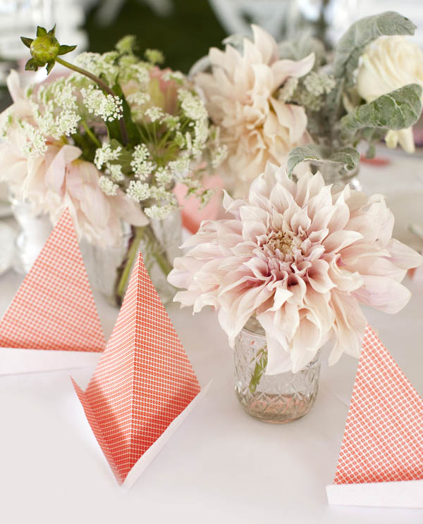
Unique floral centerpieces for each table alongside handmade sailboat origami as a nod to the nautical setting
We used Mason jars for our floral decorations, some of which were suspended along the aisle chairs during the ceremony and doubled again as centerpieces for the reception. The aisle jars and centerpieces included Queen Anne’s lace and featured mixed floral assortments as well as more monochromatic bunches. Each table was decorated with two to three unique Mason jars as centerpieces alongside the sailboat origami I crafted using chiyogami paper.
Other Details
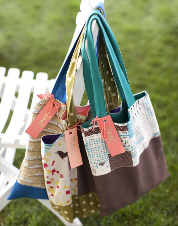
Custom Jamie Lau Designs reversible totes for out of town guests
In addition to creating our handmade garland and guestbook, I also made special gifts for my bridesmaids and close female friends, all of whom traveled in to Seattle for the wedding. I designed a custom reversible tote bag for each of them with fabric and colors that suited their individual personalities (even adding longer straps for my tallest friend!). I started off my sewing career making reversible tote bags, so this was also a homage to all their support in my creative endeavors and career change throughout the last few years.

Cherry almond pie pop wedding favors
I coupled the place cards and wedding favors into one. For wedding favors, I thought it would be fun to give out cherry almond pie lollipops from High 5 Pie to truly bring it all full circle since we first met at Pies ’n’ Thighs. (Yes, our reception menu included fried chicken and beef brisket entrées. Plus, Kyle and I are both huge Twin Peaks fans). I tied coral-colored yarn bows around the pie pops and clipped the place cards onto the stems with individual clothespins. I decorated the clothespins with washi tape, similar to what I used to seal off the invitation envelopes. When guests opened up their place cards, they were greeted with a fortune, which we selected for each guest using a random fortune cookie generator.
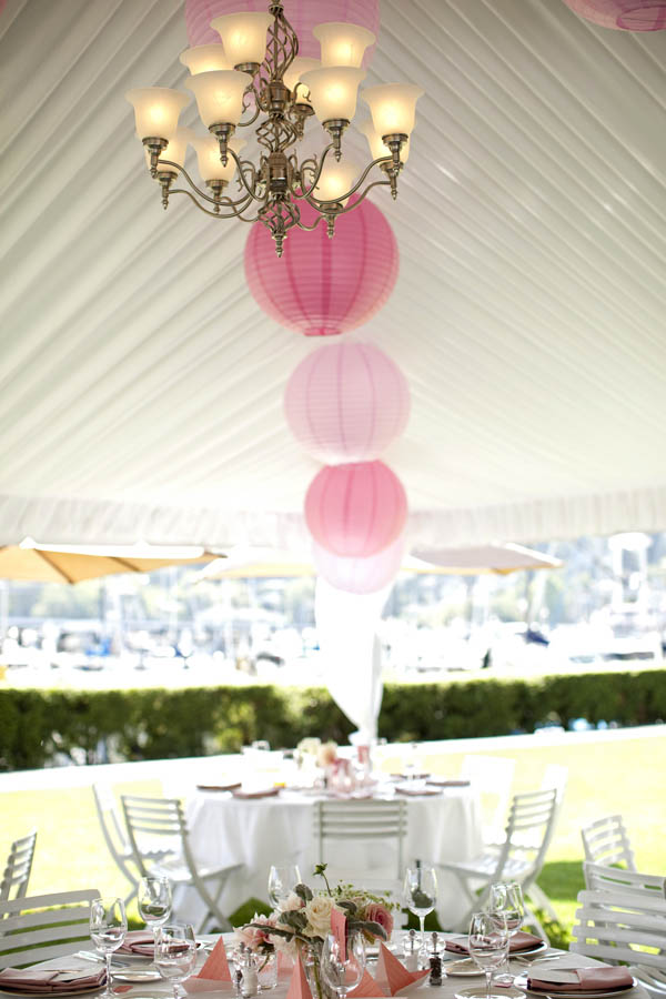
Large paper lanterns in alternating shades of pink were suspended from the reception tent
I now have the pleasure of working with other brides to design and create their custom wedding dresses (and offer wedding planning tips along the way). Check out my Real Weddings Follow-Up interview for some practical wedding planning advice and visit Martha Stewart Weddings to view more photos from our special day!